This Indian painting of a prize stallion being presented at a royal court in Rajasthan will blow you away
[ad_1]
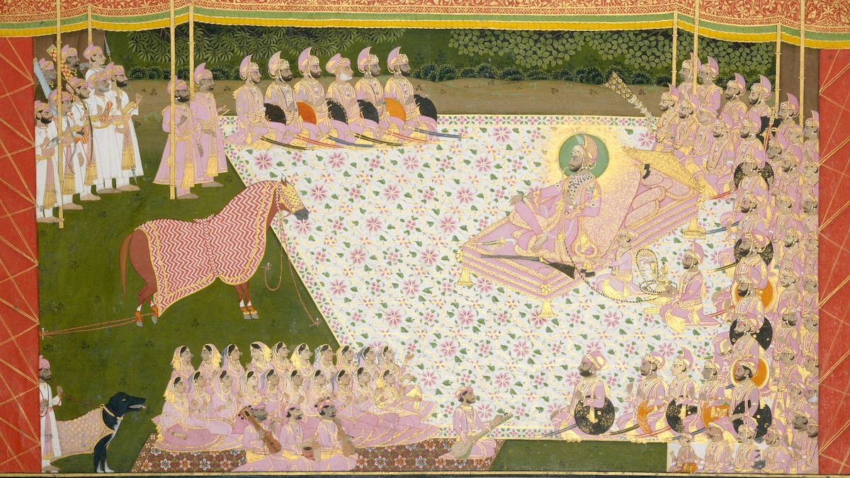
The combined effect of optical dazzle, sumptuous detail and color intensity in this Indian miniature at the Metropolitan Museum of Art leaves me cross-eyed with pleasure. The work, which shows a prize stallion being presented to the maharana of Mewar in Udaipur, Rajasthan, was painted in 1845-1846 by an artist known as Tara. He worked in the court of Sarup Singh, who ruled between 1842 and 1861.
The painting, “Maharana Sarup Singh Inspects a Prize Stallion,” is almost two feet wide, so “miniature” feels a little misleading. But it’s the term customarily applied to works from India painted in gouache (opaque watercolor) on paper in either the Mughal or Rajput traditions.
Tara’s painting was made at the tail end of the Rajput tradition — the period shortly before the British government wrested control of much of the subcontinent from the East India Company. By then, foreign influence had already shaken up India’s centuries-old painting traditions, resulting in a westernized style that came to be known as Company painting.
But some royal courts maintained a precarious degree of autonomy from the British, and they held onto court traditions. Rulers such as Sarup Singh continued to patronize in-house painters such as Tara — family-based artisans about whom little is known but who carried on an extremely sophisticated tradition.
The designs of Indian miniatures were first drawn in rough outline in charcoal, which was subsequently painted over with sanguine followed by a very thin coat of white priming. The outlining, still showing through, would then be reemphasized with black line before color made from finely ground pigments was applied in a careful sequence. After each layer was laid down with brushes made from the finest animal hair (taken from squirrels or horses or even from inside the ears of calves), the sheet would be placed face down on a flat surface and burnished with a heavy stone to fuse the pigments. In the final stages, outlines would be emphasized to give the image the necessary crispness, stippling added and gold applied (which was fiendishly tricky). Finally, the artist would zero in on the finest details, enhancing the color around eyes, lips and jewelry.
The zigzag pattern on the blanket covering the stallion here is not “naturalistic.” It doesn’t, that’s to say, ripple, recede or otherwise mold itself to the horse’s body. It’s as flat as a French crepe. But it fizzes with an almost aggressive opticality, revving into life a picture that might otherwise wilt in the tropical heat of its own overweening exquisiteness.
The details are brilliant. Notice the ropes that restrain the legs of the horse, the panting dog at left, the background foliage, the two gorgeously patterned carpets and the astonishing gilded floral pattern on the tent roof. Among the men, observe the variety of beards (punctuated by the occasional clean-shaven cheek). One of the men at right turns to face in the opposite direction, as do two of the women at left.
So many other things — weaponry, musical instruments, jewelry — reveal themselves the longer you look.
But Tara clearly knew how to rise above his role as a mere documentarian of court life. For me, what makes the painting so captivating is the elegant dispersal of busy patterns within flat, calming areas of pink and green, and the overall palette, which is both beautifully harmonized and surprising: green and pink, gold and red, black and white, with scattered touches of brown and orange.
You can’t really explain color, which may be why Indian painting, which is so contingent upon the magical interplay of saturated hues, can seem underserved by theory or scholarship. You just see it, and the pleasure signals that flow back and forth between your eyes, your brain and your body either respond or they don’t.
But oh! when they do, how incredibly sensuous, volatile and precious life feels.