‘This Is What Democracy Looked Like’ author Alicia Yin Cheng discusses election ballot design
[ad_1]
“It was a fundamental revelation for me, as I was researching, that these ballots don’t operate the same way that we think that they do now,” she said during a recent phone conversation. Early ballots, which were produced by individual parties, “were not cast in private, so they were meant to be literally a public display of your allegiance.”
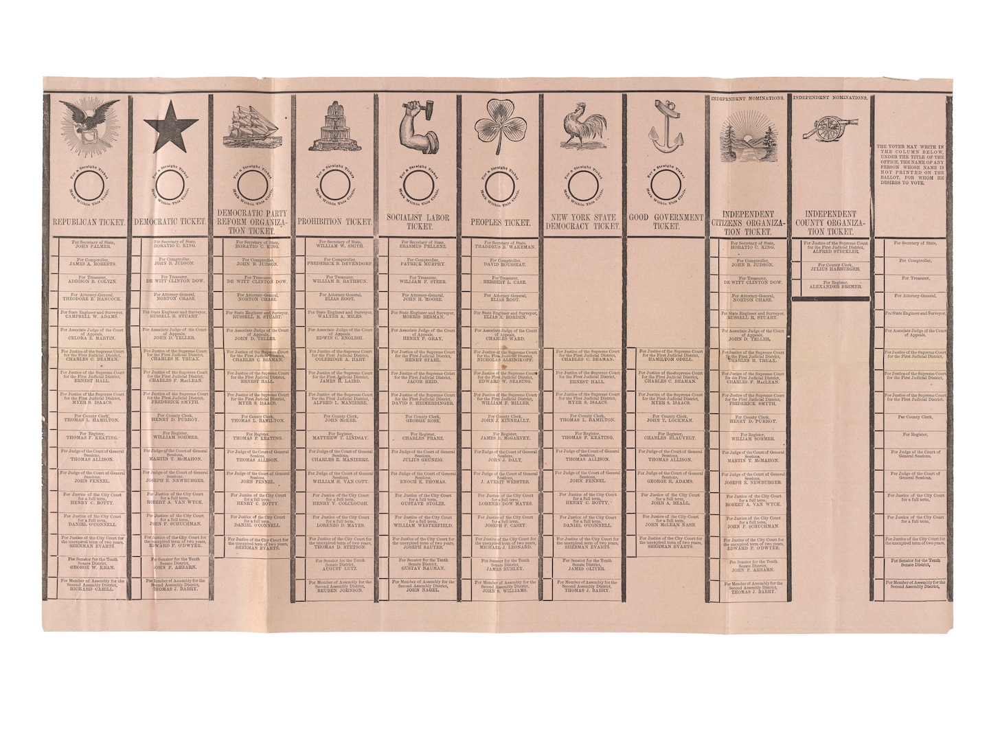
And what a display they were. Parties experimented with dramatic imagery and pointed slogans to set their ballots apart and differentiate themselves from the competition (unless, of course, they were copying another party’s ticket to deliberately confuse voters). These practices disappeared around 1900, when, inspired by Australia’s voting system, the states began administering standardized ballots, and voters could make their picks in private.
This interview has been edited for length and clarity.
How did you end up writing the book?
I was reading an article by Jill Lepore in the New Yorker about how we used to vote. This was back in 2008. It was just such a revelatory article for me to understand the early voting practices and what that entailed. And then, as she was describing ballots, very briefly, she just mentioned that they were colorful. That alone, from a designer’s perspective — I thought, what? Because, as a participating citizen, I have seen the ballot, but I never thought twice about it as a graphic object.
Which ballots most interested you?
The ones that really piqued my interest [included] ones that were extremely colorful when I felt like it wasn’t necessary to festoon them. Certainly the aesthetics of that period — the 1820s to ’60s — were very ornamental, Victorian, et cetera. But there was one that was more of a rainbow print, from the American Antiquarian Society, which was this crazy thing, and I just wondered, why would this happen? So seeing that kind of example and being a designer was especially fun to unpack, because I could take it to a letterpress printer and ask, what do you think the process was for this?
Another ballot [has] this crazy, curved, hand-drawn insertion [of the name Edward Flaherty]. It’s those moments that you know there’s something going on here, because why would that be so curved? Which, then, as an amateur student of history, I realized that you don’t always know the answer, you can only speculate. So I thought, maybe they were trying to curtail people modifying the ballot in a way that made it difficult for them to just draw a line through a name, and it ends up being this curvy, weird serpentine thing.
I was a little surprised by how blatantly racist some of the ballots were.
Right. Before the two-party system that we know today, there was a proliferation of political parties and factions. Many were based on platforms that would be shocking to us today: anti-Chinese and anti-immigration slogans were vividly illustrated on the ballots. Parties back then took pride in their stance against the immigrant hordes encroaching on their livelihood. It all sounds so eerily familiar now. There was one candidate in San Francisco who said if he would gain office, he would run all the Chinese out within 24 hours of his victory. And a lot of people were into it.
That is another kind of shocking aspect that is not relegated to that time period either, because in Louisiana, I think in the ’60s, the candidates’ names were listed with their race alongside the party affiliation. Even though the ballots are relics of an earlier time, the themes they represent still prevail: voter suppression, party control, partisanship, electoral fraud. It’s all still there.
What were some historical moments when ballot design most drastically changed?
That moment in our history when, around 1900, voting becomes a private act. They required that the state produce it and that all the candidates would be listed on one ballot by office. That was really radical. That’s a huge shift in terms of how the layout is dictated. So that’s why the ballots get suddenly super boring.
As a designer, is it sad for you that things have gotten so bland?
I think I called it “graphically torpid” in the book, but before that it was a typographic carnival — just too nuts to be believed. I happened to be in town for an election in Amsterdam, and it was like a graphic designer’s fantasy. Everything from the signage to the ballot was beautifully typeset and everything was really well organized and considered. But, you know, that’s Holland, a much smaller country. We are a glorious rainbow coalition of messy individuals. And that’s what our voting practices look like, too.
Stephanie Merry is editor of Book World.
This is What Democracy Looked Like
A Visual History of the Printed Ballot
Princeton Architechtural Press. 176 pp. $29.95
